Sunday, July 5, 2020
Tuesday, June 9, 2020
How to reset the Samsung Galaxy S10+
Why reset the Smasung Galaxy S10+?
- Unresponsive device
- Slow device
- Unexpected errors
- App crashes
- Smartphone issues, app crashed or errors are not resolved with a restart
- Your Galaxy S10+ is unresponsive
- You are selling your phone or handing it off to another family member
Now that we have that out of the way, below are a handful of different methods with step-by-step instructions on how to restart or reset your Samsung Galaxy S10+.
How to restart your Galaxy S10 (reboot or soft reset)
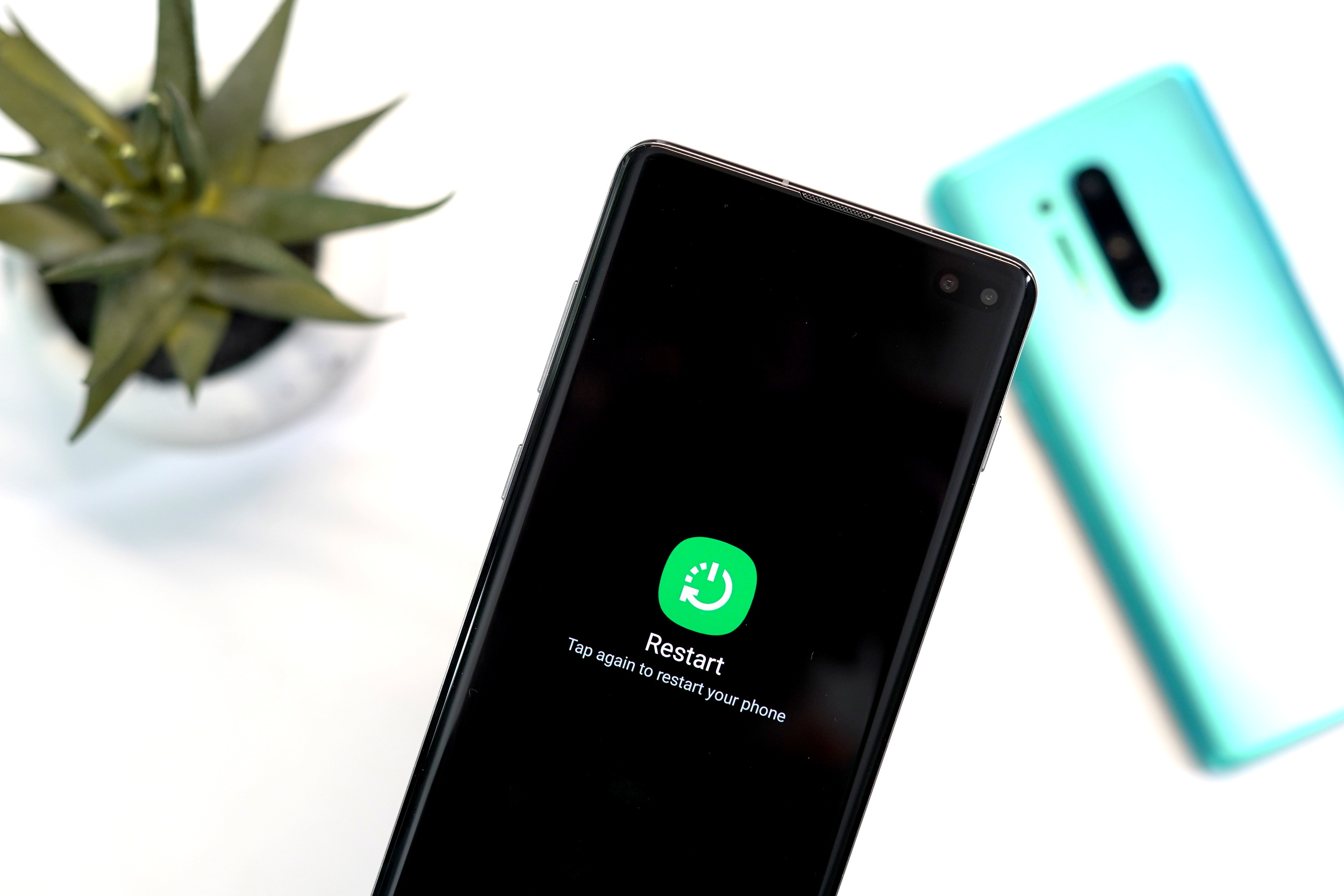
Samsung Galaxy S10+ restart
- Press and hold the Power button on the side of the Galaxy S10+
- When the power button menu appears, press Restart twice
- Your Galaxy S10+ will restart after a few seconds
Samsung Galaxy S10+ quick restart
- Simultaneously press and hold the Power and Volume down buttons for seven seconds
- Your Galaxy S10+ will restart
Samsung Galaxy S10+ Schedule auto restart
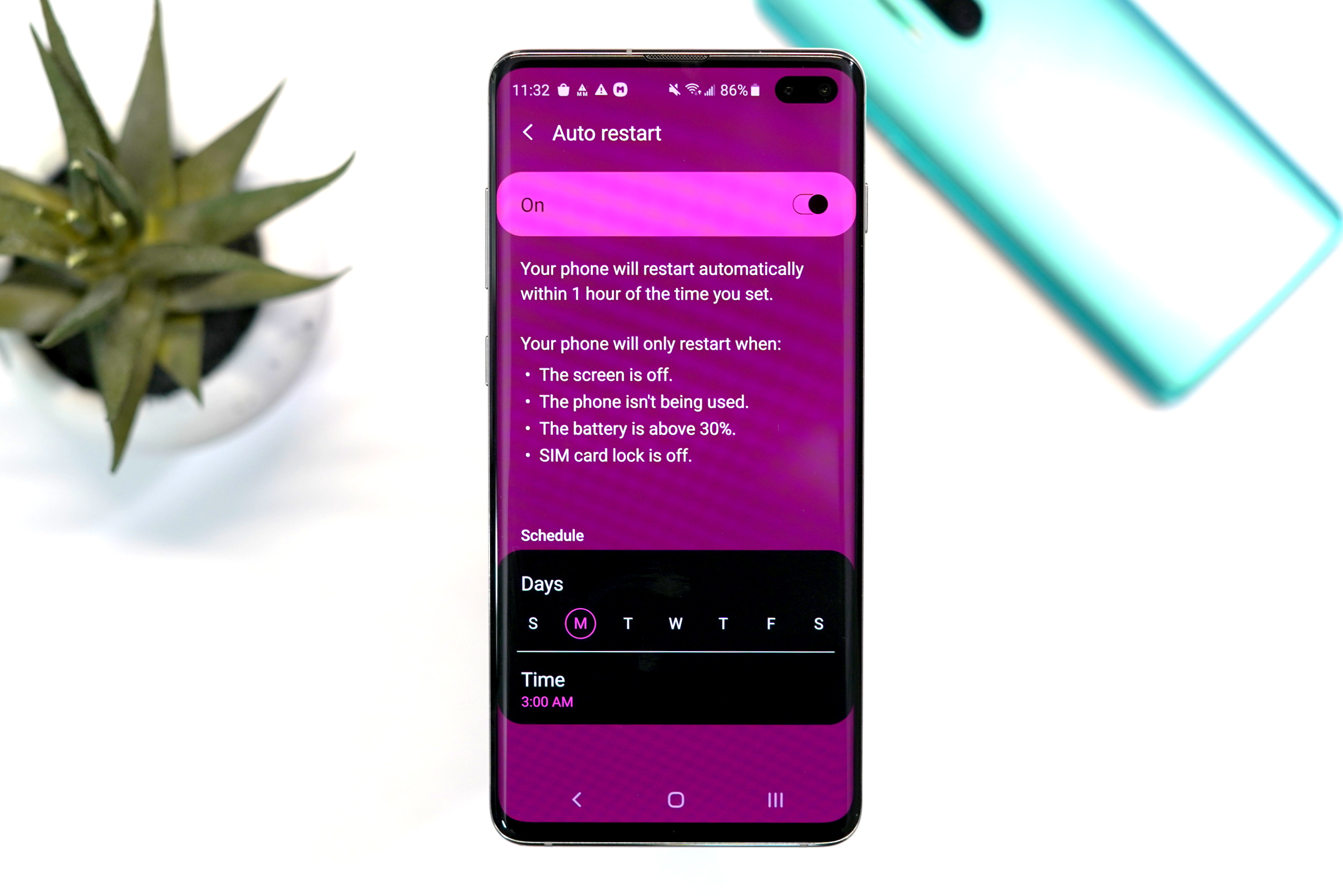
- Open Settings > Device care > Three-dot menu in top right corner > Advanced > Auto restart > Off/on toggle
- Tap at least one day of the week in the schedule section
- Tap Time to change the scheduled hour for the auto restart.
How to factory reset the Galaxy S10+ (hard reset)
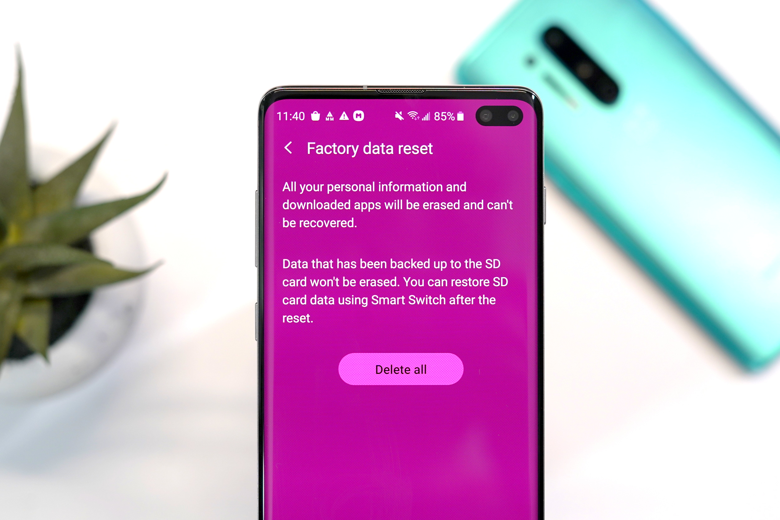
Samsung Galaxy S10+ simple factory reset
- Open settings Settings > General Management > Factory Data Reset > Reset
- Enter your PIN, Password or Unlock Pattern
- Tap “Delete all”
- Enter your Google Account password to start the factory reset process
- The reset process will take several minutes
- After the reset has completed, the phone will reboot to start the setup process
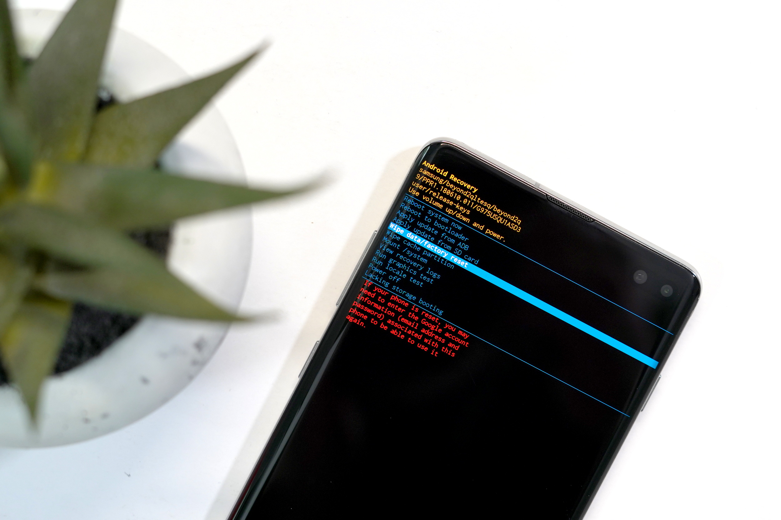
Samsung Galaxy S10+ Recovery mode factory reset
- Turn off the Samsung Galaxy S10+
- Simultaneously press and hold the Volume Up, Bixby and Power buttons for 15 seconds
- When the recovery screen appears, you can use the Volume Up/Down buttons to navigate and power button to select
- Highlight Wipe data/factory reset and press the Power button
- Highlight Yes and press the Power button
- The reset process will take several minutes
- After the reset has completed, the phone will reboot to start the setup process
- If the Galaxy S10+ reboots into recovery mode, highlight Reboot system now and press the Power button
Remote factory reset and wipe
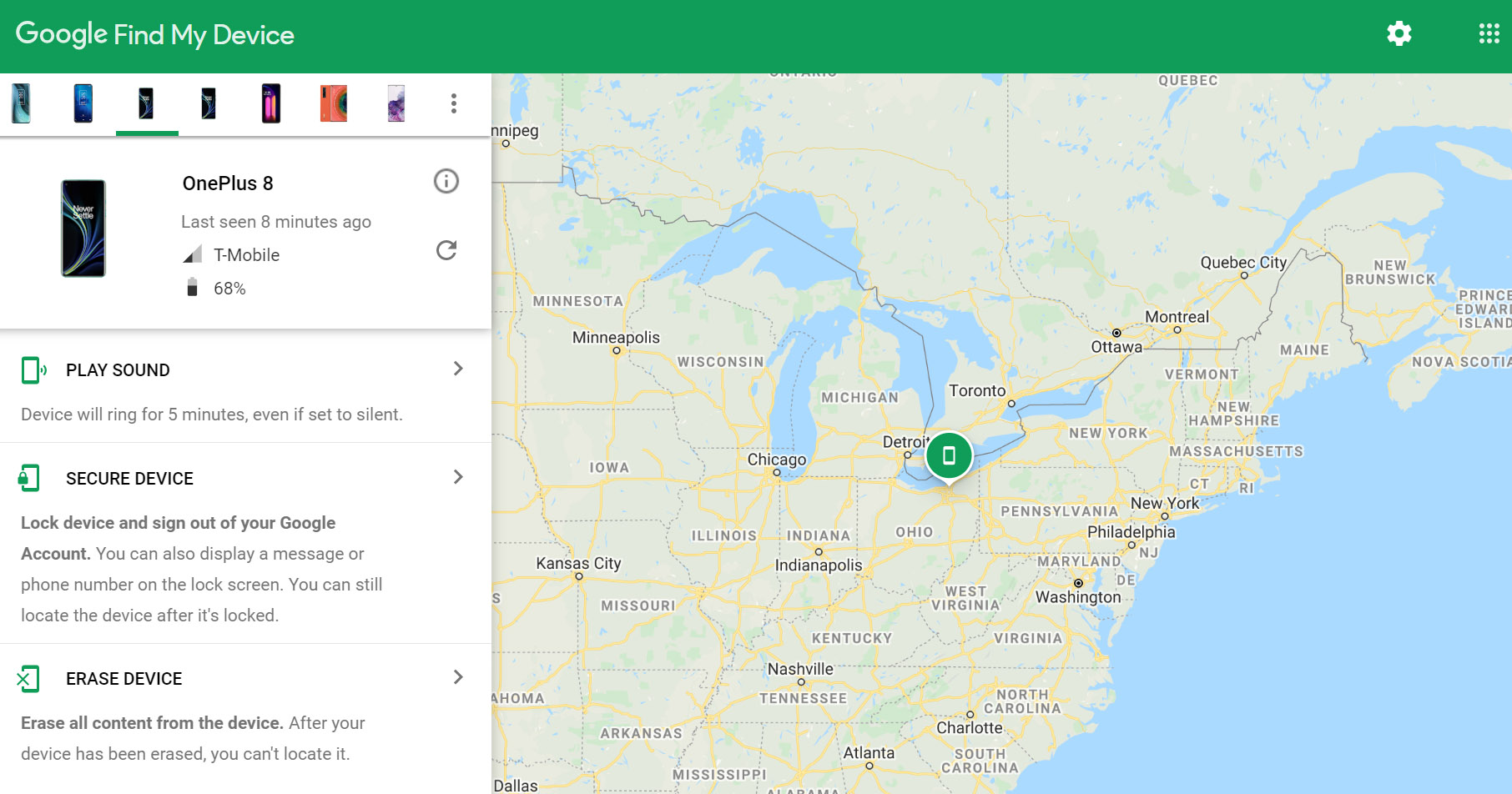
- Visit the Google Find My Device website from a computer, smartphone or tablet
- Log into your Google Account
- Select your Galaxy S10+ from the device list and then select “Erase Device”
- Select “Erase Device” again
- Enter your Google Account password to begin the factory reset process
Wednesday, June 3, 2020
Samsung Note 20 to drop ‘Plus’ brand in favour of ‘Ultra’
Samsung might be using its ‘Galaxy Ultra’ branding with its upcoming Note 20 handset.
In a new listing on the Bluetooth Launch Studio where the Bluetooth SIG is located, there’s a phone with the device model name ‘SMN986U that includes the design name ‘Samsung Galaxy Note 20 Ultra.’ The listing was first spotted by the XDA Developers.
The model number listed is what’s been associated with the long-rumoured Note 20+ since the device first leaked. If the Bluetooth SIG is correct, then Samsung will call its handset the Note 20 Ultra and not the previously rumoured Note 20+.
The Note 20 Ultra is rumoured to sport a 6.9-inch screen with a variable refresh rate up to 120Hz, a 108-megapixel primary shooter, and a 4,500mAh battery.
With the 108-megapixel primary camera and its 6.9-inch screen, it makes sense Samsung would give the smartphone the same branding as the S20 Ultra.
Sunday, May 31, 2020
Samsung Galaxy S8 Review
As the biggest Android manufacturer in the world, Samsung typically doesn’t have much to worry about when it comes time to launch their new flagship. This year’s different. After the failed launch of the Galaxy Note 7, Samsung now has to convince the world they still have what it takes to build a quality smartphone, one that is capable of capturing the hearts — and wallets — of consumers the world over.
Samsung is also facing some pretty stiff competition this year. The LG G6 and HTC U11 are the best smartphones we’ve seen from their respective manufacturers, and with a completely redesigned iPhone 8 just around the corner — Samsung really needs to bring their “A” game this year.
Their latest entry into the crowded smartphone market is the Samsung Galaxy S8 and Galaxy S8+, two devices that come equipped with beautiful curved displays and more hardware/software features than you can shake a stick at. We’ve spent an extended amount of time with the Galaxy S8 and are ready to bring your our unabashed and brutally honest review. Buckle up.
The Good
- Gorgeous design
- Small bezels
- Surprisingly quick iris/facial scanning
- 64GB of internal storage AND a micro SD slot
- Always On Display
- Dual Audio and Separate App Audio
- Samsung DeX desktop interface
- Samsung Pay
- Waterproof
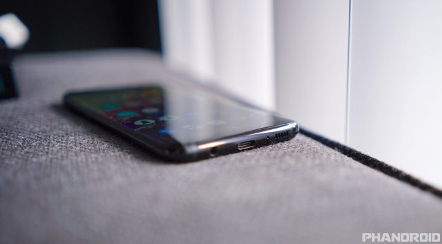
- Headphone jack
The Bad
- Curved display
- Display issues (red tint inconsistencies, burn-in, grayscale banding)
- TouchWiz is still stuttery as ever
- Camera’s excessive noise filtering
- Overly aggressive RAM management
- Fingerprint placement and performance
- Speaker quality
- Old fast charging tech
- Bixby is useless and Samsung wont let you remap its hardware button
Design & Build quality
The good
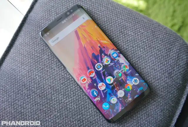
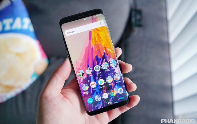
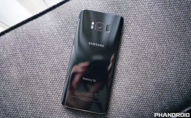
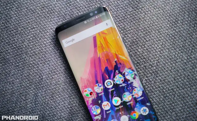
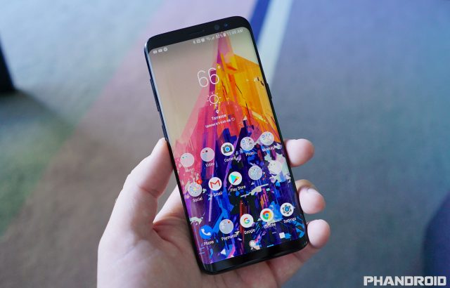
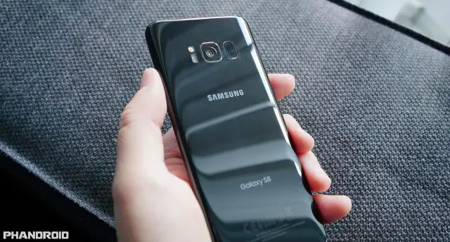
There’s little to be said about that Galaxy S8’s design that you can’t already tell by looking at it. It’s easily one of the best looking smartphones in the world and although it’s not exactly functional, Samsung’s curved “Infinity Display” plays a large role in that. Where most smartphones these days are little more than boring slabs with huge, thick bezels, the Galaxy S8 smashes previous conventions with a phone that’s slim, has no camera hump, features small bezels, has a big display, and yet is still somehow easy to hold with one hand. It’s quite simply, a feat of mobile engineering.
Since the Galaxy S6 Edge, the future of Samsung’s flagship line was always going to be curved displays. It was, after all, the only model Samsung showed in their advertisements and for good reason: it was different.
Fast forward to today where Samsung has officially dropped the “Edge” name entirely, introducing nothing but curved AMOLED displays for their flagship line. Love it or hate it, this is the future Samsung has envisioned and simply put — it looks amazing. I would say photos don’t do it justice, but they do. This thing looks just as good IRL as it does in photos (with the exception of Samsung’s ads which falsely hide the side bezels to further emphasize the phone’s curved edges).
That being said, I was never big on Samsung’s previous Edge smartphones. Sure they looked cool, but it didn’t take a rocket scientist to see that they were painfully awkward to hold. Quite literally the furthest thing from ergonomic, but a lot has changed since then. Like some of you, I was ready to dismiss the S8 based purely on the Edge screen, but changed my tune after finally getting a chance to hold it.
First off, the metal frame surrounding the Galaxy S8 is much less pronounced than it was with the S7 Edge. It’s been completely flattened out and gives your fingers more surface area to hold onto. Sounds like a small detail but this combined with the stainless steel metal finish — as opposed to that Teflon coating they used in the past — makes for a phone that feels absolutely wonderful in the hand.
Even so, the sides of the phone are still extremely small and can be tough to get a firm grip on, but Samsung has done a bang up job at preventing accidental screen taps even when your sausage fingers inevitably begin to encroach on the sides of the display.
Speaking of the Edge screen, it’s now much more subtle than it was on previous Galaxies. Samsung has finally given up on trying to make it seem useful by curving it over the sides (it never offered any benefit over a flat display) and confirmed what we’ve known all along: the edge screen is only there for looks. This now means the Edge screen doesn’t actually bend over the sides as much and Samsung has done a great job and preventing accidental screen taps even when your sausage fingers begin to encroach on the display.
The Galaxy S8 is easily one of the most premium feeling smartphones I’ve had the pleasure of holding and a testament of how far Samsung has come in terms of design and build quality.
The bad
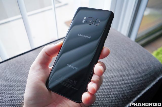
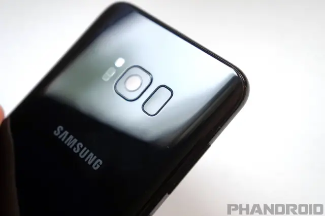
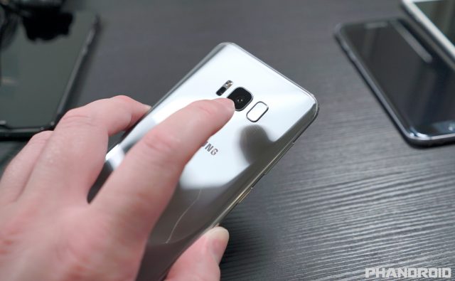
That’s not to say I love everything about the Galaxy S8’s design. For the first time in years Samsung has finally done away with the front mounted fingerprint sensor in favor of a rear placement. Without getting into front vs rear fingerprint sensor debate (I, personally, prefer mine on the front) everyone can agree that Samsung’s bizarre placement is the worst design decision ever.
Unlike most every other Android device on the planet, Samsung has placed their sensor right beside the camera in something that feels more like an afterthought than an intentional, well thought out move. Because the camera and sensor both sit flush with the back — and the small border surrounding the sensor is exactly the same as the camera — it’s virtually impossible to tell if your finger is over the sensor or the camera. This is what we in the biz call a “design flaw.”
Also, as many a reviewer have pointed out, the back glass is a fingerprint magnet. While the glass is a necessary trade-off in order to keep wireless charging (you really have to applaud Samsung for sticking with it all these years) it’s an absolute nightmare to keep clean. Samsung made the same mistake they did with the S7. There’s absolutely no oleophobic coating on the back glass — with the exception of the camera — to prevent fingerprints and smudging from building up.
Remember, this wasn’t always the case. The Galaxy S6 had an oleophobic coating on both the front and back of the device, allowing you to easily wipe away and fingerprints and grime that would build up. Seems like a no-brainer for a phone made almost entirely out of glass, right?
Display
The pièce de résistance of this year’s Galaxy S is Samsung’s new “Infinity Display.” I’ve talked about it in length in a post where I describe it as arguably one of the S8’s worst features, but we’ll get into that later.
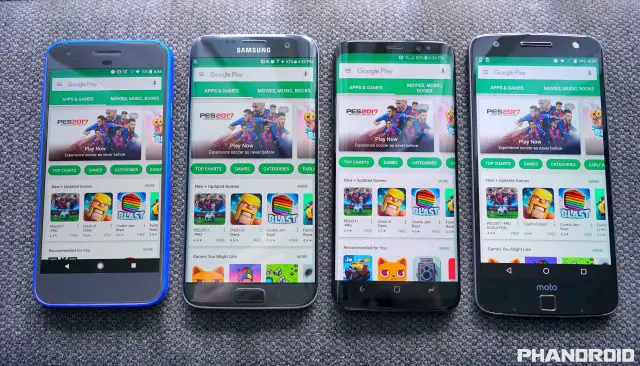
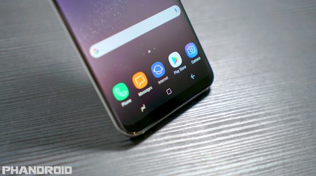
Coming in two sizes — 5.8 or 6.2 inches — Infinity Display is just a fancy name for the S8’s curved AMOLED display panel and wonderfully small bezels. Unlike Galaxies before it, the bezels no longer match the color of the phone. They’re black across all models and colors, probably an effort to hide or minimize their appearance.
Small bezels are clearly the way to go if you’re using software buttons and Samsung has successfully managed to make every other device (onscreen buttons or not) look extremely dated. It’s so bad, I’m having an extremely difficult time returning to my Pixel or Moto Z.
It’s long been a dream of mine to own an Android device with tiny bezels and finally take back some of that screen real estate lost to Android’s on-screen big, black navigation bar. While this is true about the S8, Samsung took things a step further…
18.5:9 is the new 16:9
Not only did they shrink the bezels on the S8, but they also stretched the display to an odd 18.5:9 aspect ratio. This gave Samsung the opportunity to increase the screen size (which looks great on paper), while still keeping an overall smaller form factor. It sounds great in theory, but I’m on the fence about it. Here’s why.
On one hand, the phone easier to hold with one hand, but this doesn’t necessarily mean it’s any easier to use since the length of the display is now much, much taller. This requires some clever finger gymnastics in order to reach the notification pull down or higher placed UI elements with your thumb.
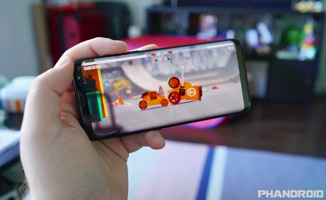
The weird aspect ratio also affects apps, games, and videos, some of which aren’t compatible with the 18.5:9 aspect ratio. To compensate, big black bars will appear on the tops and bottom of the display creating virtual bezels, although some apps/games can be forced into full screen mode inside the S8’s display settings. It’s just another inconvenient step required from the end user and, worse case scenario, can even break some apps.
I’m not convinced 18.5:9 was the proper way of going about handling this. It’s form over function. Had Samsung stuck with the standard 16:9 aspect ratio — like you find on every other phone, or television — and simply shrank the bezel, this wouldn’t have been an issue. If it ain’t broke, don’t fix it.
Curved display gets in the way
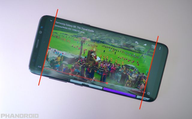
Without a doubt, the biggest shortcoming to the Galaxy S8’s display are the curved edges which now appear across all models. I think we can all agree that on the surface, it looks great. Most folks love the way it spills over the edges, minimizing the appearance of the side bezels (but not nearly as much as Samsung makes it look in press renders). I’ll admit, it looks cool — really cool — almost like something out of science fiction, but it provides no practical benefit over a flat display. In fact, it’s actually the opposite.
If any other manufacturer launched a new smartphone with fantastic OLED display — the only caveat being an excessive amount of distortion and light bleed along the side edges — reviewers would be eating them alive. Why does the S8 get a free pass?
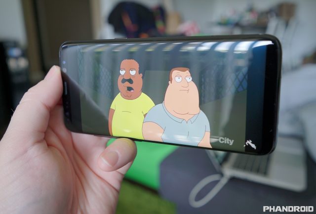
Now, Samsung attempts to fix some of these issues using software tricks, but you have to tune it yourself and it never 100% fixes the discoloration or distortion you see along the edges, so images always look a bit off. Aside from that, the curved edges create an excessive amount glare so that even when you position the phone at an optimal viewing angle, you can forget about the edges. This makes the phone an absolute nightmare when viewing full screen video or playing games.
If a curved display was in any way practical then we would see similar applications on computer monitors, TVs, and the like. Why don’t we? The answer is simple: because it’s a gimmick.
Oh, and good luck finding any decent screen protectors that offer 100% protection (the few that do create a weird oil slick/rainbow effect in the middle). Once again, the curved screen is more trouble than it’s worth.
In summary: small bezels = good. 18.5:9 aspect ratio = bad. Curved display = GTFO.
Other display features
Another unique aspect of the Galaxy S8’s display is an ever present, pressure sensitive home button. During times when the nav bar is hidden (viewing full screen media for instance), users can hard press the bottom middle of the screen to activate the home as if it was physically there. It’s the perfect way to wean Galaxy users off the physical home button they may have grown accustomed to. It’s also a feature that’s been rumored for the upcoming iPhone 8 but once again Samsung has beat Apple to the punch.
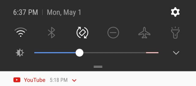
By far my favorite and arguably most underrated feature of the display is the Galaxy S8’s intelligent auto brightness. Like other devices, the phone will automatically adjust the brightness of the display based on the ambient lighting. But unlike most other devices, you can fine tune this by telling the phone where you’d like the brightness level to be at in the given lighting situation. Now your phone will never be too dark or too bright, but just the way you like it. I never use auto brightness on any of my devices but on the S8, it’s become absolutely indispensable.
Issues
Of course, the usual AMOLED pitfalls still very much apply to the Galaxy S8. We’ve already seen reports of burn-in on the device, despite various software tricks to minimize its effects (we wrote up a great post on preventing — and reversing — these effects on the Galaxy S8).
There are also color inconsistencies across devices, something that manifested itself as a strange red hue on some units. This prompted Samsung to issue an update to help address this, allowing users to adjust the hue of their display in order to balance things a little better.
Camera
Hardware
Every year we’ve watched as Samsung introduced brand new camera tech in their flagship Galaxy S line. Apertures grew wider, pixels became larger, and — like many of you — it was easy to assume that things would be further improved on the S8.
Oddly enough, the Galaxy S8 features mostly the same hardware specs as last year’s Galaxy S7. The S8 still has a slight leg up thanks to a newer updated Sony IMX333 camera sensor and, according to Samsung, improved image processing. Other than that, we’re looking at a similar 12MP “Dual Pixel” sensor with an f/1.7 lens, phase detection auto focus, OIS and the ability to shoot in RAW (for the .001% of people actually interested in this feature).
They did, however greatly improve the front facing camera, adding an 8MP, f/1.7 shooter complete with auto focus, something you don’t see much of on other devices. It’s significantly better than the S7’s and by George, it needed to be. The S7’s front facing camera was easily one of the worst cameras out there.
Features
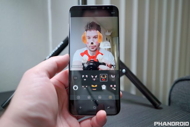
Samsung’s camera software itself has grown into a complete bloated mess, but on the flip side has more features than you can shake a stick at. There’s a new slide-to-zoom shutter button and the usual variety of camera modes — including a full manual mode — gestures to switch between rear and front facing cameras, and even Snapchat-like augmented reality filters.
As with previous Galaxies, you can download additional camera modes from the Galaxy Apps store but there’s few that really add anything worthwhile to the camera app. I did like that Samsung is one of a few Android OEMs making an effort to include a Live Photos like feature (they call them Motion Photos), but it’s hidden inside the camera app’s settings so it’s easy to miss.
Photo quality
So how well does the S8 shoot? Well, if you were hoping for something drastically better than previous generation Galaxies, you may be disappointed. Results are nearly identical to the S7/S7 Edge, with the S8 having much better dynamic range. It’s almost as if some level of HDR is always on, even when the actual feature is turned off. This is probably where Samsung spent most of their time tuning, but it’s not all roses…
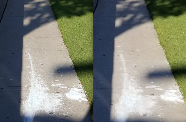
Galaxy S6 (left), Galaxy S8 (right)
For one, Samsung is now going overboard when it comes to noise filtering — even when shooting at its lowest possible ISO — causing S8 to err on the side of caution. Whether it’s concrete, grass, stucco, or fabric, anything with finer texture details is smoothed out beyond recognition. We saw this in Joe’s comparison with the LG G6 and it’s immediately apparent when comparing the S8 against its predecessors.
Like most cameras, shooting in daylight is preferred but take away just a little bit of that light and the Galaxy S8 camera begins showing its true colors. That’s not to say low light shooting is terrible, but it barely gets a passing grade. I will say that macro shots — providing you give them enough light — look particularly stellar on the Galaxy S8, more-so than other devices. Closeups of food, objects, faces, or just about anything creates a nice depth of field, with a smooth, natural bokeh. This was a particular high point when snapping photos.
Video quality
Video on the Galaxy S8 is also where the camera shines. Using a combination of electric and optical image stabilization, lightning quick focusing (without that hunting in/out you find on other devices), video recorded on the Galaxy S8 looks fantastic. If there’s a lot of movement, you’ll see some artifacting here and there, but overall it looks great. It’s possible to get borderline DSLR quality video if you mount the phone on a tripod. Of course, nighttime video is another matter entirely, which is a challenge for most any smartphone given their tiny sensors. Check out our results below.
All in all, I was a tad bit disappointed by the Galaxy S8 camera. Not because it was bad, but because it wasn’t great. Nobody is denying that the Galaxy S8 can take a beautiful photo — these days, most top-tier smartphone cameras can — but there isn’t much here that will really wow you. Video is a particular strong suit, but for the most part it just feels like business as usual for Samsung. I’d imagine they’re saving more interesting tech — like dual cameras — for next year’s model (or possibly even the Note 8) but with competition like the Google Pixel and HTC U11, it’s sad to see Samsung’s current flagship not put up more of a fight.
Software
Custom UIs are one of Android’s necessary evils. While some are certainly lighter than others, Samsung’s TouchWiz UI has always been a bit on the heavier side of the spectrum. At one point Samsung appeared to be dialing back their software with the Galaxy S6, but those days have long passed.
TouchWiz is just as bloated and convoluted as ever, bleeding into every corner of the OS and taking up almost 11GB of internal storage. There are some pretty useful features here — many of which should, and possibly even could — find themselves folded into Android proper. I’m by no means an “Android purist,” but Samsung has been doing a bang up job of transforming Android into its own OS and that’s never been closer to being a reality than TouchWiz on the S8.
This doesn’t just affect the way the OS looks (UI), but apps and services as well. For every Google app or service, there’s a Samsung equivalent. You’ll see this when you first start the device and are immediately met with barrage of notifications asking you to setup this or sign into that. It’s a bit overwhelming and quite excessive. You almost get the sense that there’s battle being waged inside your device, one where Samsung and Google are duking it out for your loyalty with various apps/services.
We’ve covered nearly every single Samsung software feature in our 65+ Tips & Tricks post — as well as 14 First Things Every S8 Owner Should Do — so I wont spend too much time detailing every feature. Instead, I will quickly go over a few standout software features from the Galaxy S8, those that impacted me the most.
Secure Folder – This is where you can lock everything from images, media, contacts, emails, even apps behind a secure password. It’s like having a phone inside your phone and the perfect way to keep your work or separate life private.
Always On Display – AOD is easily one of the most underrated Galaxy S8 features. It’s an always on, low-power lockscreen that shows you app notification icons, time and even features interactive widgets. It’s incredibly robust and you’ll find tons of settings and options to tailor this to your need. Being able to glance down at your phone to see the time, date, and notifications eliminates the need to constantly power on the screen to see if you’ve missed anything.
Samsung DeX – This is an interesting feature, the only of which requires an accessory to activate it. The Samsung DeX dock is a bit on the pricey side but allows users to connect their phone and transform the UI into a desktop mode. The dock has connections for a keyboard, mouse, and monitor, and while this certainly isn’t for everyone, could be the perfect thing for business types or those that really need to get work done on their device.
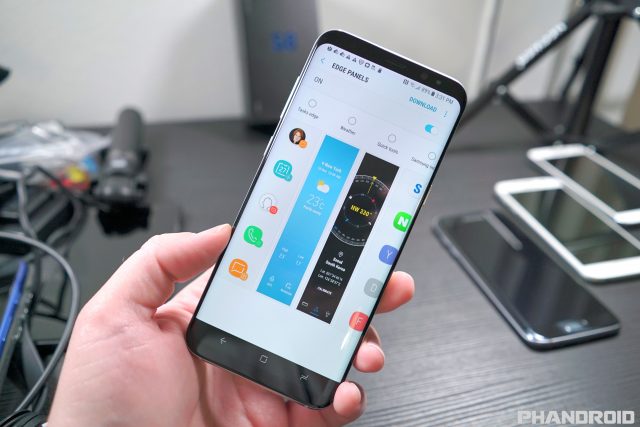
Smart Select – It’s the only “Edge panel” worth using and allows you to quickly record a GIF anywhere on your screen. Sounds small, but sometimes it’s the little things that make all the difference.
Intelligent auto brightness – Like most devices, the Galaxy S8 will automatically adjust the brightness of the display according to the ambient lighting but it doesn’t always get it right. Sometimes the display is either too dark or bright for your liking. By adjusting the brightness slider while in auto mode, you can tell the phone how you like the brightness level in that situation and it’ll remember for next time. It’s absolutely brilliant.
Security – The Galaxy S8 is cock full of security features, everything from locking down your device with your eyes, to the Secure Folder to lock apps, media, and other content on your device. Samsung’s really thought of everything and this is reflected in almost all aspects of the phone. For instance, you can’t even power down the device without entering your password first, a great way to locate your device via GPS if it becomes lost or stolen. There’s also the SOS mode, which allows you to send an SOS message to loved ones, complete with your current location, photos taken with the front/rear cameras, and even record sound.
More is less MORE
Samsung is definitely going for the kitchen sink approach when it comes to software features on the Galaxy S8, cramming anything and everything they possibly can into the device almost because they can. I’d love of it if Samsung took a step back and really looked at their data to see what features their customers are, in fact, using and which might need to finally be retired.
There’s just so many options and settings, even as a more experienced smartphone user, it’s easy to feel overwhelmed. It’s by far the most bloated custom Android UI you’re likely to ever come across and I’m not entirely sure that’s a good thing. It certainly doesn’t help that they’ve included unfinished software like Bixby — their halfhearted attempt at an intelligent assistant — which launched in a incomplete state.
Emoji
Kill it with fire
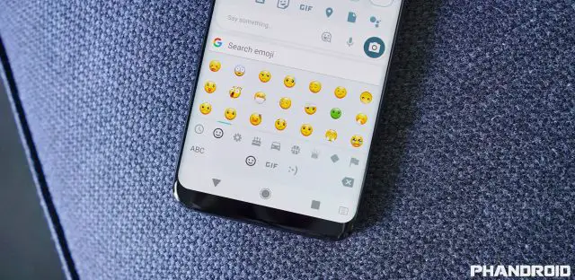
It almost seems silly to mention but Samsung’s god-awful emoji designs really needs to be pointed out — perhaps even screamed from the highest rooftops — until Samsung finally does something about it. What they’ve done is completely perverted this form of communication for no other reason than to further piss all over Android’s stock UI.
It’s the very definition of a knock-off, with designs that not only look terrible, but in many cases are so off-base, they completely change the tone of messages between mobile platforms. Since emoji aren’t standardized, nobody can stop Samsung from bastardizing them on their devices but if we could make enough noise, maybe they’d have the good sense to use Android’s standard emoji (which are now pretty darn close to the design of their iOS counterparts).
No matter how you feel about TouchWiz UI, you really have to hand it to Samsung — they’ve arguably contributed more to Android than most OEMs. As it stands, Samsung is so far ahead of the game in terms of raw software features that it will take years for Apple — or even Google — to catch up. Now if they could really buckle down on improving performance and fluidity of the UI, they’d be untouchable.
Performance
The Samsung Galaxy S8 is one of the first devices on the planet to come equipped with Qualcomm’s Snapdragon 835 processor. This should, at least in theory, give the phone a sizable advantage over the competition and while this might be reflected in benchmarks, real world performance is more of a mixed bag.
It’s the same sad story we’ve seen in previous Samsung devices. The Galaxy S8 features some of the most aggressive RAM management in the biz, making the 4GB of RAM feel more like 2. Apps close in the background much quicker than you’ll find on just about any other Android device with comparable RAM. It may not sound like a huge deal, but it means you’ll spend more time waiting for your apps to re-open from a cold start than returning to them instantly. All that extra downtime is frustrating to say the least.
Don’t get me wrong. The Galaxy S8 is still plenty “fast” at opening apps, web browsing, loading YouTube videos, or playing games (it’s clear upgrade from a Snapdragon 821 powered device) but there’s still a fair amount of jank when it came to UI animations, transitions, and the like. This has long been an issue with TouchWiz and it’s sad to see even the Snapdragon 835 fall victim to Samsung’s poor optimizations. The end result is a phone that is nowhere near as snappy as the HTC U11 (which is powered by the same processor) and can’t even provide the same buttery smooth UI of budget devices like the Moto G5 Plus.
On the plus side, the UI has no trouble keeping up with all your finger swipes as there is virtually zero scroll lag to be found on the device. Users will immediately notice a phone that’s not only faster than their old phone, but more responsive as well.
The big question is how long the Galaxy S8 can keep this up. Samsung flagships have a long history of performance issues that plague the device after a few months, so it’s something we’ll definitely need to keep an eye on.
Battery Life
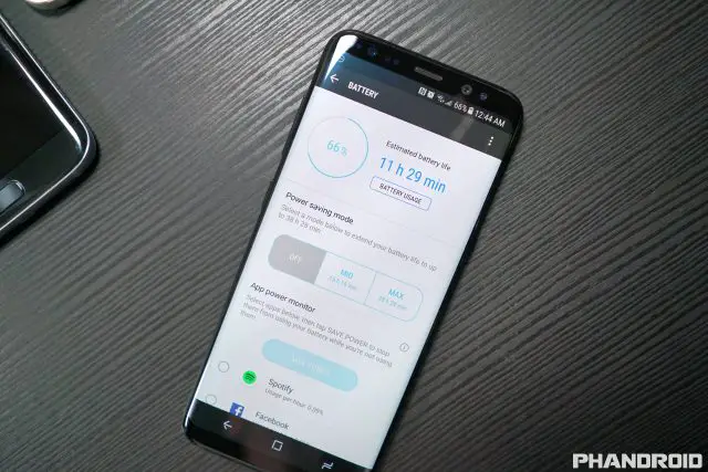
Battery life is one of those things that will never be the same for any two people but having tested so many devices as my daily driver, I have a pretty good idea of what constitutes as bad, good, or great. The smaller Galaxy S8 packs a 3,000mAh battery, while the larger S8+ houses a 3,500mAh battery.
For me, battery life for each of the devices in their given size category was mediocre at best. My Galaxy S8 consistently struggled to hit 3 hours of screen-on-time while the S8+’s 4-5 hours was definitely better than that, they were both pretty much on par with other similarly equipped devices. Not bad by any means, but definitely nowhere near great. Depending on which device you’re coming from, keep your battery life expectations low with the S8/S8+ and you wont be let down.
Interestingly enough, the Always On Display has a fairly big impact on standby battery life, consistently dropping the battery on the regular S8 about 1% every 15 minutes or so. This is in stark contrast to the LG G6 which has their own version of this feature, yet barely drops the phone’s battery 1% every few hours.
For times when you know you’re going to be away from the charger for a longer than normal period of time (theme park of family outing), you’ll definitely want to consider bringing a portable charger with you. The good news is there are a ton of great accessories for the Galaxy S8 that should help. We recently reviewed these affordable battery cases for the S8 which worked great.
That lead me to my next biggest gripe. If you know you’re releasing a phone that isn’t going to break any battery life records, the very least you can do is make sure it charges up in the fastest amount of time possible, right? It’s 2017. We’ve seen a lot of advancements in fast charging technology over the past few years. Motorola has their own 30W Turbo Charging technology, Google’s using the USB compliant Type C Power Delivery (3A) on their devices, while Qualcomm has been touting Quick Charge 4.0 as the next best thing.
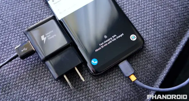
So imagine my surprise to find that the Galaxy S8 and S8+ was using the same old Adaptive Fast Charging tech that debuted all the way back on the Galaxy S6. It’s the equivalent of Quick Charge 2.0 and while it’s definitely faster than what you would get with the iPhone 7, it really could have helped soften the blow you get with mediocre battery life on the device.
The worst part about Samsung’s Adaptive Fast Charging is — unlike Quick Charge 2.0, 3.0, 4.0 — it doesn’t work while you’re using the device. If the screen is on, a notification will tell you that your phone is “Fast Charging” but forgets to tell you that actual fast charging doesn’t work until the screen goes off. It’s a pretty big limitation, one you wont find on any other device.
Battery life is a huge, often times the biggest deciding factor when people are trying to figure out if they should upgrade to a new device or not. For Samsung to have no put any effort into extending battery life — or improve charging times — is absolutely perplexing.
I will hand it to Samsung for sticking with wireless charging on the device. The Galaxy S8 is one of the few phones available that still includes this feature and the fact that the phone works with both WPC and PMA, takes the guesswork out of compatibility (although we’ve seen reports that the Galaxy S8 may have trouble with some 3rd party charging pads). With rumors that Apple could do the same for the iPhone 8, we could see a resurgence of the technology as it goes mainstream.
Other
There are plenty of other hardware/software features to be found on the Galaxy S8, some that are certainly worth mentioning. In this section I will explore a few of my favorites, while diving into a few things that just really bothered me about the phone.
Samsung Pay
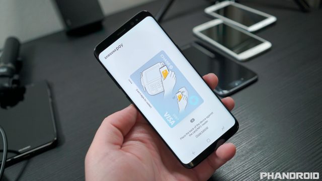
I always thought Samsung Pay is one of those extra features that was always kinda neat, but not something I’d ever see myself using. That changed the day I forgot my wallet at home and was forced to use my phone for all my purchases. While tap-to-pay are more prevalent these days, they’re still not everywhere. Since Samsung Pay also works with regular credit card readers, it finally revealed itself as a game-changing smartphone feature and you can only get it from Samsung.
Fingerprint sensor
You probably wouldn’t even consider buying a phone without one but how about a phone that has the worst fingerprint reader in existence? I’m not just talking about placement either (which is quite literally a design flaw). The fingerprint reader on the Galaxy S8 is horrible on all accounts.
The fact that there’s no camera hump or fingerprint sensor indentation means you can’t tell if you’re fingering the camera or the fingerprint sensor. This is only made worse a slow and inaccurate the fingerprint reader that constantly fails to recognize prints, or takes an eternity to unlock the phone while you carefully reposition your finger for another try.
Without question, it’s one of the worst fingerprint sensors I’ve used in quite sometime, forcing you to reply on other forms of authentication like the S8’s iris or facial scanning (which do work great, by the way).
Waterproofing
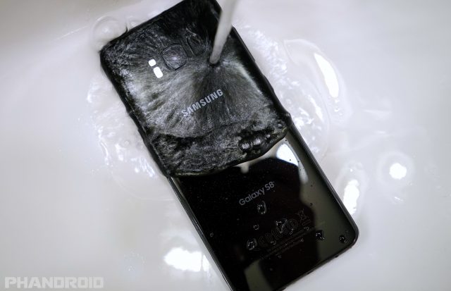
You can talk about RAM and octa-core processing speeds all day, but a waterproofed smartphone is one of those hardware features that really resonates with consumers. The legacy continues with the Galaxy S8 and while there are some trade-offs (like piss poor speaker quality), I honestly wouldn’t have it any other way.
Speaker
Speaking of the speaker on the Galaxy S8, it’s bad. Real bad. The volume is low at anything but the highest volume and quality sounds like the phone is underwater. While it’s easy to excuse this as a side effect of waterproofing the device but both the LG G6 and iPhone 7 — which are also waterproofed — sound much better. Samsung could have improved this by using both the earpiece and bottom firing speaker (like on the iPhone),
Bluetooth 5.0: Dual audio & Separate app audio
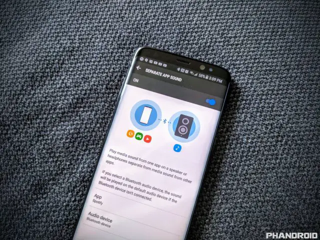
Dual Audio was one of those hyped Galaxy S8 features everyone was talking about for awhile there. Thanks to Bluetooth 5.0, Dual Audio lets you to connect to two separate Bluetooth audio devices at the same time. There can be some lag between the two devices, so it’s not exactly practical but once speakers, headphones, etc. start coming equipped with Bluetooth 5.0 hardware, this should no longer be an issue.
Separate app audio on the other hand allows you to play audio from a single, specific app to a Bluetooth audio device. In theory, you could have Spotify playing through a Bluetooth stereo, while still being able to watch YouTube videos, play a game, or anything else without interrupting Spotify playback. Make sense? Unfortunately, the feature doesn’t exactly work, although I did have success getting it to work the other way around by selecting an app to play through my phone’s speaker, while all other media (including Spotify), played through my Bluetooth audio device.
Headphone jack
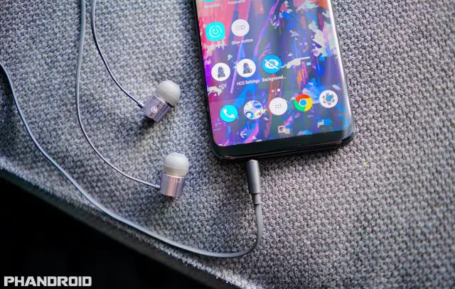
It feels wrong to include this as some sort of unique hardware feature, but at the rate smartphone OEMs are removing this from their devices, it wont be long before all of them follow suit. While Samsung most certainly could have went the Apple route and removed it, they’re keeping it around for another year and we really have to applaud them for that.
The downside is audio quality being pumped through the headphone jack isn’t very good, nor powerful. While Samsung does provide some software tools to help adjust the EQ, don’t expect anything outside of the standard sound quality you get from any other device. But hey, it’s better than nothing.
Dedicated Bixby button
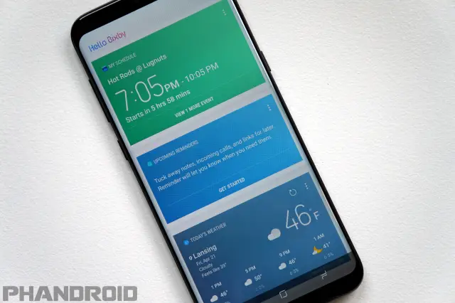
If the slow loading Bixby app wasn’t bad enough, Samsung added insult to injury by blocking the remapping of the Bixby button in a recent software update. At one point, it was actually possible to have the Bixby button launch any app of your choosing, something that apparently ruffled Samsung’s feathers the wrong way. Removing this functionality isn’t just dumb, it’s borderline user-hostile.
Conclusion
I know it sounds crazy, but I’m sort of torn on the Samsung Galaxy S8 and S8+. Over the course of the past month, I’ve formed a sort of love/hate relationship with the device. On one hand it’s the most refined, well-built smartphone Samsung has ever made. Whatever your feelings are on curved displays, you can’t deny that Samsung has created a smartphone all their own and in a world of cheap iPhone knockoffs, that’s extremely rare these days.
Apple has already proven that if you make technology sexy — it will sell. I think that’s sort of what we’re seeing with the Galaxy S8. Early reviews were so caught up with the look of the phone (the small bezel and curved display are quite attractive) they were willing to overlook — or perhaps even ignore — many of the phone’s shortcomings. And while the Galaxy S8 could very well be the best Android device currently available, that doesn’t mean it’s perfect. Far from it. For every great quality, you can find something else the phone doesn’t do very well. Some of these things are basic but fundamental hardware features like the ill-placed and slow performing fingerprint sensor.
The old saying “Jack of all trades, master of none” couldn’t possibly be better suited for the Galaxy S8. It doesn’t have the best camera, or the best battery life, nor the best audio, or even the best display. I just can’t shake the feeling that Samsung was holding back more than they were making an honest attempt at building the best smartphone they possibly could. In many cases the Galaxy S8 feels more like a Galaxy S7S than a true, honest to goodness sequel.
Don’t get me wrong. The Galaxy S8 is good. Really good. But by no means does it blow away the competition. Sure there are hundreds of features and some people will actually see value in that (even if they don’t even use a fraction of them) — that’s okay. Others may hate the form factor and see some of the phone’s shortcomings as major deal breakers — that’s fine too.
I’m still not sure if the Galaxy S8 is the undisputed king of Android. For every great hardware feature, you can find another Android device that does the same thing only better, but none offer such a well-rounded, complete package and none that do it this attractively. When it comes to mass appeal, sometimes that’s all that really matters.
- Gorgeous design
- Small bezels
- Surprisingly quick iris/facial scanning
- 64GB of internal storage AND a micro SD slot
- Always On Display
- Dual Audio and Separate App Audio
- Samsung DeX desktop interface
- Samsung Pay
- Waterproof
- Headphone jack
The Bad
- Curved display
- Display issues (red tint inconsistencies, burn-in, grayscale banding)
- TouchWiz is still stuttery as ever
- Camera’s excessive noise filtering
- Overly aggressive RAM management
- Fingerprint placement and performance
- Speaker quality
- Old fast charging tech
- Bixby is useless and Samsung wont let you remap its hardware button
The Bottom Line
The Galaxy S8 is the Swiss Army knife of smartphones. Just because it does most things well, doesn’t mean it’s perfect. You can find other devices that offer better audio, better cameras, better displays, modularity, or even better pricing for similar spec’d hardware — but you’ll be hard pressed to find a smartphone that does so much with as much style and beauty as the Galaxy S8. For some, that’s all that really matters.


