If you’re planning to build an awesome web page layout, you’ll need to know about margins, borders, padding, and content. Every element in web design, whether it’s an image or text, uses a box with these properties. You can easily build complex layouts by playing around with the box model. In this article, we’ll dissect the CSS Box Model and show you how to use these properties with practical examples.
What Is the CSS Box Model?
The CSS box model is a standard created by the World Wide Web Consortium. It describes all the elements in an HTML document as rectangular boxes with their own dimensions. These boxes contain a content area and optional surrounding margin, border, and padding areas. So, let’s explore the parts of a CSS box.
Let’s uncover the four layers of the CSS box model.
First Layer: Content
The content area contains the main content of the element which could be an image, text, or any form of media content. You can modify the dimensions of block-level elements using height and width properties.
Second Layer: Padding
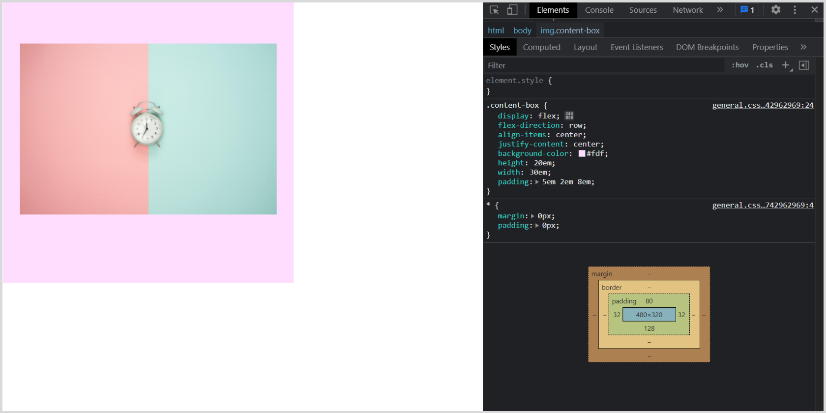
Padding is the space between the content box and its border box. Though it sits around your content as whitespace, you can use a background color to visualize the difference. You can apply padding-top, padding-right, padding-bottom, and padding-left properties to modify the space.
Third Layer: Border
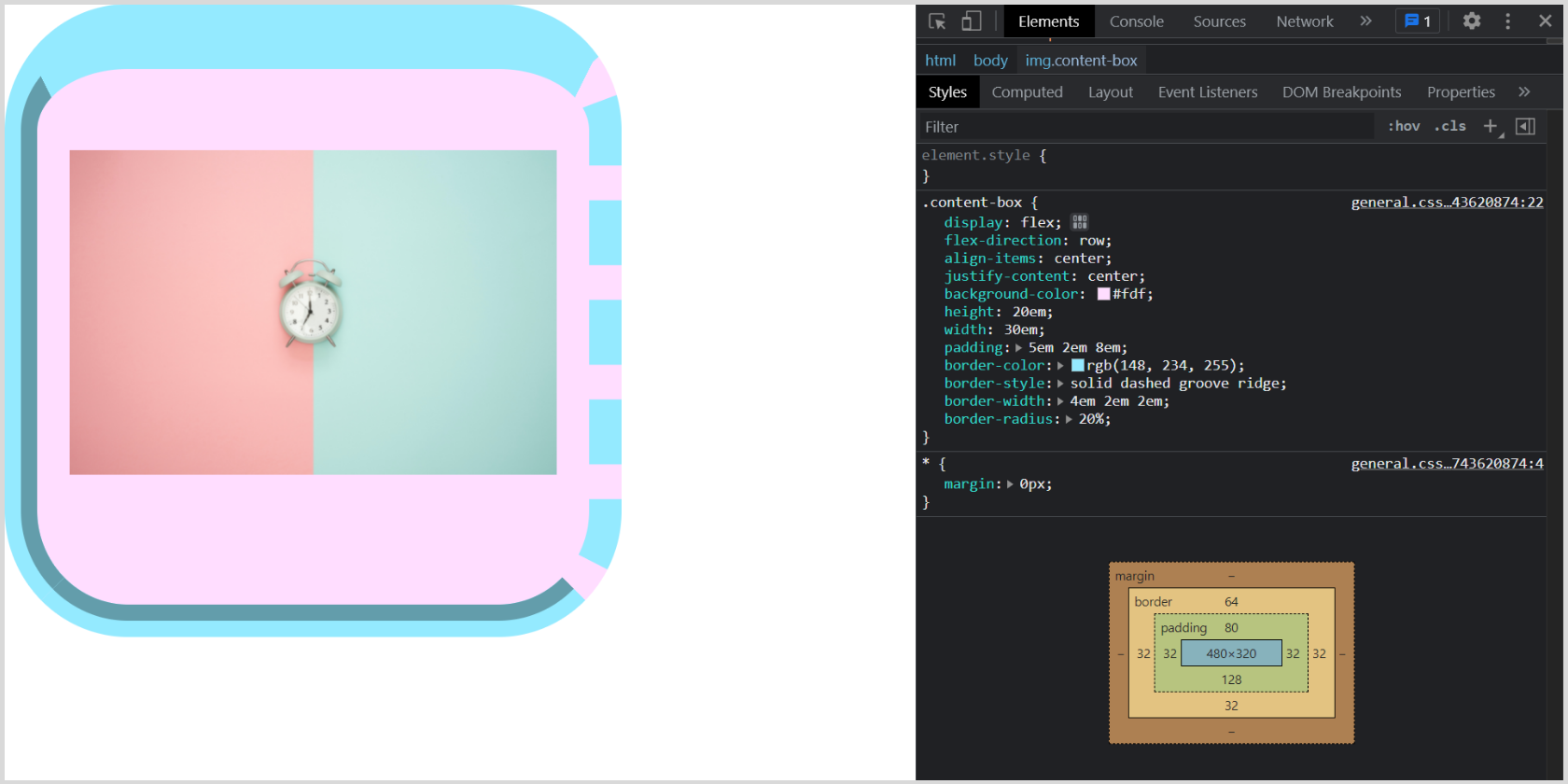
The border wraps the content and the padding area. You can resize and style the border using border-width, border-style, and border-color properties.
Fourth layer: Margin
The last layer of the box model is widely used to generate space between elements. The margin wraps the content, padding, and border area. You can use margin-top, margin-right, margin-bottom, and margin-left properties. You can also give the margin property a negative value or auto to achieve some awesome placement techniques.
Project Setup for CSS Box Model
Let’s build a mini project to demonstrate the basic box model with a content box and padding, border, and margin properties. You can go with text, image, or media content. We’ll start by making sure that it is properly structured.
Structure With HTML
<!DOCTYPE html>
<html lang="en">
 <head>
   <meta charset="UTF-8" />
   <meta http-equiv="X-UA-Compatible" content="IE=edge" />
   <meta name="viewport" content="width=device-width, initial-scale=1.0" />
   <link rel="preconnect" href="https://fonts.googleapis.com" />
   <link rel="preconnect" href="https://fonts.gstatic.com" crossorigin />
   <link href="https://fonts.googleapis.com/css2?family=Rubik:wght@400;500;600;700&display=swap" rel="stylesheet" />
   <link rel="stylesheet" href="style.css" />
   <title>CSS Box Model</title>
 </head>
 <body>
   <img class="content-box display" src="img/second-content-image.jpg" alt="smartphone">
   <img class="content-box" src="img/content-image.jpg" alt="clock">
 </body>
</html>
Output:
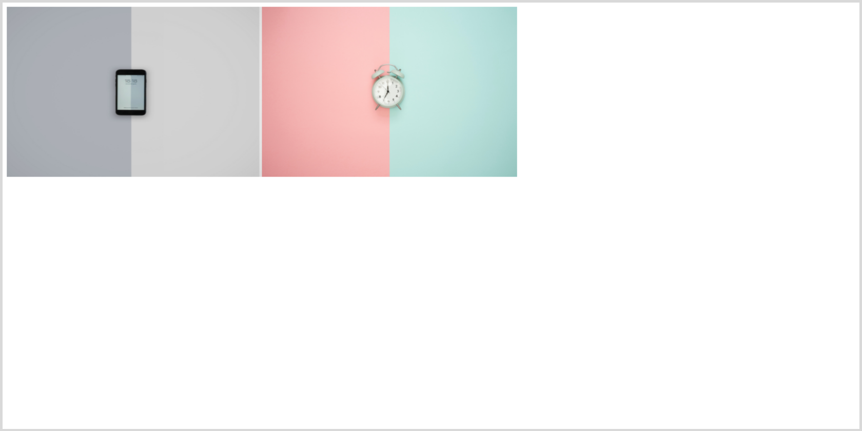
You can use built-in features of your browser, such as the Chrome Developer Tools, to see what's going on. We’re using two images from Unsplash. For simplicity, we’ll hide the smartphone image using display: none; until we need it later.
Styling Using CSS
/*************************
BASIC STYLING
*************************/
* {
 margin: 0px;
 padding: 0px;
}
body {
 display: flex;
 flex-direction: row;
}
.display {
 display: none !important;
}
Now, let’s style our content box. First, we’ll set the height and width of the image. Also, giving a background color helps in better visualization. So, let’s do it.
/*************************
CONTENT BOX
*************************/
.content-box {
 display: flex;
 flex-direction: row;
 justify-content: center;
 align-items: center;
 /* Styling the content box using height and width properties */
 background-color: #fdf;
 height: 20em;
 width: 30em;
}
Give Content Room to Breathe With Padding
You can either set padding-top, padding-right, padding-bottom, and padding-left properties individually or use the shorthand. Try to use the shorthand if possible, since it can save you some time. Let’s see how padding works.
 /*************************
 PADDING
 *************************/
 /* Applying padding */
 padding-top: 5em;
 padding-right: 2em;
 padding-bottom: 8em;
 padding-left: 2em;

 /* Padding shorthand */

 /* top/right/bottom/left */
 padding: 5em 2em 8em 2em;

 /* top/horizontal/bottom */
 padding: 5em 2em 8em;
Output:
Draw Lines Around Padding Using Border
While applying the border property, make sure that you are using the border-color property to give the border a distinct color from the background. You can select the border-style either individually or in one go by using the shorthand property. The same applies to the border-width property.
You can also set the border-radius to give the box rounded corners with a radius in px, rem, em, or percent.
 /*************************
 BORDER
 *************************/
 /* Applying border properties */
 /* Set the border color */
 border-color: rgb(148, 234, 255);
 /* Select border style */
 border-top-style: solid;
 border-right-style: dashed;
 border-bottom-style: groove;
 border-left-style: ridge;

 /* border-style shorthand */
 /* top/right/bottom/left */
 border-style: solid dashed groove ridge;

 /* Set border width */
 border-top-width: 4em;
 border-right-width: 2em;
 border-bottom-width: 2em;
 border-left-width: 2em;

 /* border-width shorthand*/
 /* top/right/bottom/left */
 border-width: 4em 2em 2em 2em;

 /* top/horizontal/bottom */
 border-width: 4em 2em 2em;

  /* border property shorthand */
  /* border: 4em solid  rgb(148, 234, 255); */

 /* Set border-radius */
 border-radius: 5em;
 border-radius: 20%;
Output:
Add Space Between Boxes With Margin
You can center a box horizontally using margin: 0 auto, provided it has a definite width.
 /*************************
 MARGIN
 *************************/
 /* Applying margin properties */
 margin-top: 4em;
 margin-right: 5em;
 margin-bottom: 3em;
 margin-left: 5em;

 /* Margin shorthand */
 /* top/right/bottom/left */
 margin: 4em 5em 3em 5em;
 /* top/horizontal/bottom */
 margin: 4em 5em 3em;

 /* Using auto margin */
 margin: 3em auto;
Output:
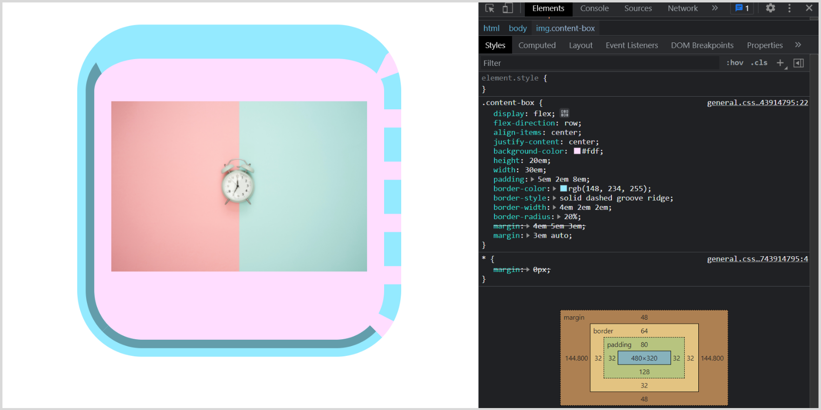
You can specify the margin property using one, two, three, or four values. The values can be a length, percentage, or a keyword like auto. Let’s understand how it works:
- When you specify only one value, it means that all four sides will have the same margin.
- When you specify two values, the first value signifies margin-top and margin-bottom while the second value specifies margin-right and margin-left.
- When you specify three values, the first and last apply to margin-top and margin-bottom respectively. The middle value is for the horizontal area, i.e., margin-right and margin-left.
- When you specify all four values, they apply to the top, right, bottom, and left (in clockwise order) respectively.
Note that you can also use these shortcuts for padding and border properties.
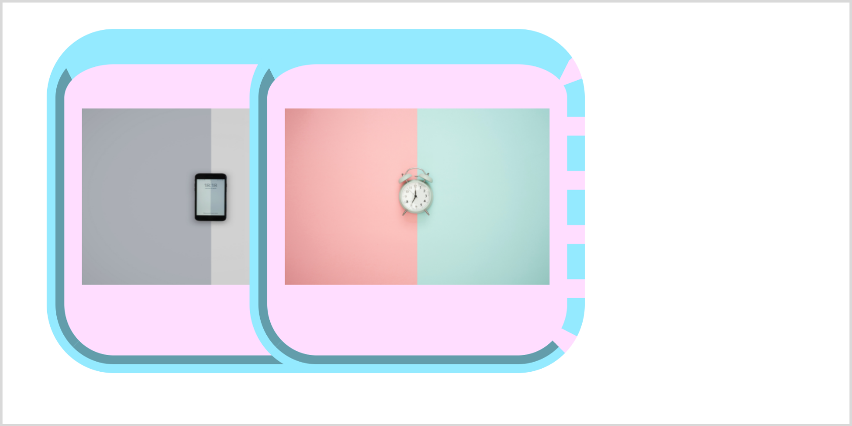
Have you ever used a negative margin? To visualize it let’s erase display: none to display our second image, then set a negative margin.
/* .display {
 display: none !important;
} */
.content-box {
 display: flex;
 flex-direction: row;
 align-items: center;
 background-color: #fdf;
 height: 20em;
 width: 30em;
 padding: 5em 2em 8em;
 border-style: solid dashed groove ridge;
 border-width: 4em 2em 2em;
 border-radius: 20%;

 /* Using negative margin */
 margin: 3em -20em 3em 5em;
}
Output:
The Box Model: Making a Pixel Perfect Website
The box model lets you define space between elements, add borders, and easily build a complex-looking layout. You can get started right away to create an awesome website. Meanwhile, you can explore the border-box property in detail and play around with the code above.
You should understand that there are other methods for laying out content in CSS. These include CSS Grid and CSS Flexbox. Once you're comfortable with the box model, you should continue learning about these alternatives.